Welcome to our playground.
If you want to return here, bookmark this page.
Below you’ll find a bunch of live pages which we extracted from the Assessment or Planning Explorers our clients use for planning. The first four are for districts, used by LCAP teams in California. The last one is for a high school.
Each of the visualizations contains the client (which appears in orange) plus 15 similar schools or districts. Framing the client this way lets them answer the question: “Where do we stand, compared to other schools (or districts) like our own?”
What does “like our own” mean? It means highly similar systems: same grade range served, similar enrollment. And it means highly similar students, based on the factors that districts do not control: parent education, English language fluency and free-lunch status. This makes for customized tools that fit like a glove. The comparisons control as much as possible for differences among students.
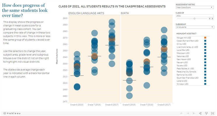
Look at the mean scale scores of semi-stable groups of students (graduating class cohorts) over three or four years’ time. We’ve organized the results so you can see Morgan Hills’ students scores compared to the state average (black bar) and to 15 other districts whose students are very similar to their own.
let us know if you'd like to see more...
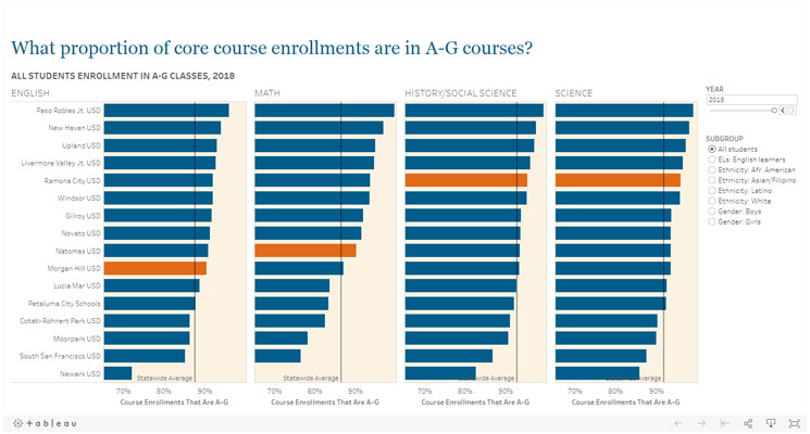
Look at the rate at which high school students in Morgan Hill USD enrolled in A-to-G courses. (These are the courses UC and CSU require of applicants.) In each of these four core-course subjects, the rate ranges from middle to top quartile of this set of highly similar districts. What we’re showing you is the percentage of all enrollments in any of these four subjects that were in the A-to-G level courses. Note that you can select subgroups of students. If you do, you’ll see them compared to the same subgroup of students in all 15 similar districts.
let us know if you'd like to see more...
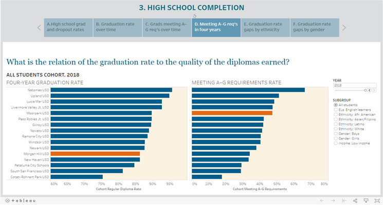
The graduation rate alone is a very incomplete measure of what graduates have studied and perhaps learned. By combining a measure of the graduates who have met the A-to-G requirements of UC and CSU, and showing this next to the overall graduation rate (cohort based), we might be able to understand how to answer more difficult questions about the education different students attain.
let us know if you'd like to see more...
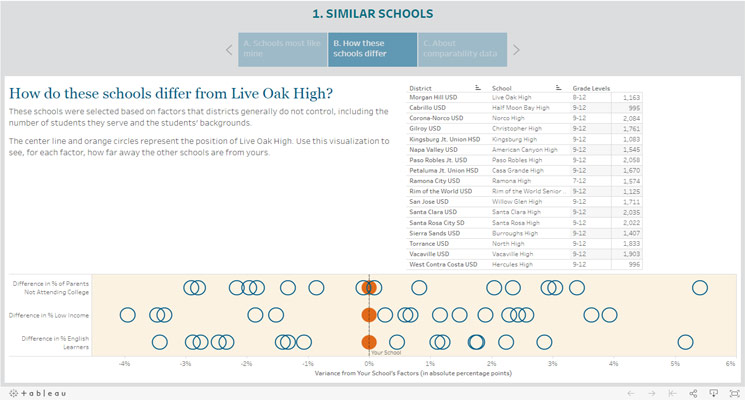
Look at the degree to which the students in 15 other high schools are similar to the students in Live Oak High in Morgan Hill USD. We’ve matched these high schools based on three student factors that most directly affect their education, based on the research we relied upon: (a) parent level of education; (b) students’ English language fluency; and (c) free-and-reduced-price lunch status of students. Each of these three factors appears in one row. So each district’s dot appears three times — once on each row. Live Oak High appears in orange, and sits at the zero mark. The horizontal axis is a measure of the degree of difference of each high school from Live Oak High.
let us know if you'd like to see more...
