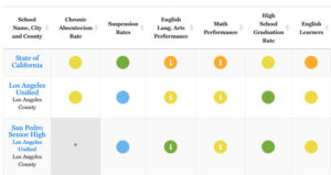
I have a hefty appetite for visual expressions of school data. So it was with a hungry eye that I saw the EdSource visual representation of the new CDE Dashboard results. I clicked … but quickly lost my appetite.
Five colors. Six columns. But no numbers. The invitation to compare schools seems tempting, until you try. What does it mean to compare a yellow to an orange in math performance? The comparisons remind me of Fruit Loops, the breakfast cereal. Take a bite, and you’ll taste a mouthful of artificial ingredients. Swallow at your own risk.

EdSource’s attempt to take the Dashboard’s colors, and use them to compare schools.
What’s the meaning of the colors for San Pedro Senior High’s students’ math scores? A combination of four things:
- The scale score of 11th grade students’ math scores;
- Their average scale score’s distance from standard (a magical threshold designed by a committee of experts and justified somewhere or other);
- The change in scale score from the average scale score obtained by an entirely different set of 11th graders;
- An adjustment factor if the participation rate of students was below 95 percent.
Separately, those four things hold meaning. But melded together they become kaka-data. Before you try to make sense of this Dashboard derived data about this schools’ students’ math results, I suggest you ask a few questions.
- What portion of the 534 students who took this test also take the course work the test was aiming to assess?
- How many questions were on this test anyway? (The answer: just 18 multiple choice questions, and between 2 and 6 performance tasks.)
- What is the degree of imprecision and uncertainty in the schoolwide average scale score, given the shallow sampling of so many math standards?
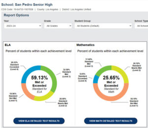
And one more question. Take a look at these students’ results in English language arts (59 percent met or exceeded standard), compared to their results in math (26 percent met or exceeded standard). Why would 11th graders smart enough to do so well in English language arts be unable to attain a roughly similar outcome in math?

CAASPP results for San Pedro Senior High.
Popularizing useless measures is not a positive contribution to public knowledge.
If California’s education leaders want to know how to make sense of results, turn toward the Illinois State Dept. of Education. Here’s a look at the vital signs of Elgin High School in Elgin, Illinois. Participation rate and proficiency are reported separately. Growth measures are reported. Science results and SAT results are reported. Student mobility is clearly reported. Teacher data is substantial, and includes teacher attendance, retention, and student-teacher ratios. The school’s summary designation is expressed in words (not colors).
I find much to praise in the Illinois Report Card. But I’ll leave that for another day, and simply urge the CDE team to scrap the Dashboard on its tenth birthday and start over with the help of the Illinois folks.


