While California district planning teams sweat the last weeks of LCAP work, many are missing recent measures of learning. Without the CAASPP, districts that lack solid interim assessment results may feel adrift, lost at sea. But the missing test results provides the ideal incentive to get some perspective, and take the long view on how your district has been doing.
For this “big picture” view, turn to a valuable gift from the Stanford Education Opportunity project. They’ve created reports (free of charge) that compare your district’s (or your school’s) students’ test results to all others in the country. The brilliant team headed by Sean Reardon and Erin Fahle have taken ten years of results of students’ test taking, and rolled them up in a form that makes it possible to answer three questions about those results:
- Level: How do our students’ scores compare to those of all other districts, and to other districts serving other communities that are socio-economically like our own;
- Rate: At what rate have our students learned? (On average over ten years’ time, did our students make more than one grade level of progress in one year, or less?)
- Trend: What is the trend in our students’ test scores over the last ten years?
Growth is the key, and “rate” is where you’ll find it
That elusive measure of growth that the CDE won’t be able to produce until 2024 has been calculated by the Stanford Education Opportunity Project. And even better, the results can be seen in comparative form. (Note there’s a lot of computational heavy lifting that makes these summary conclusions possible. If you’re like to read about their methods, they explain their approach in layman’s language on their website.) They have merged math and language arts results in the interest of reducing the imprecision in the results. And they have expressed test results in a language the public speaks: grade level. They arrive at this by finding the average score of students at each grade level. Then they use the National Assessment of Educational Progress (NAEP) to equate each state’s assessment. It is, in effect, a national norm. This has the advantage of speaking the language the public speaks.
Here, in clear language, is how the Stanford Educational Opportunity Project people explain learning rate:
“Learning rates measure how much students’ scores improve each year while they are in school. This is a better way to assess what children learn in schools than average test scores, which are heavily influenced by factors outside of school. To understand the distinction, think of a hospital: We wouldn’t assess a hospital based on the health of its patients; rather, we’d judge it on how much the health of patients improves as a result of their time in the hospital. Similarly, we shouldn’t evaluate a school based on the average scores of its students, but rather by how much their test scores improve while in school.”
Take Hayward USD for an example. On the horizontal axis, you can see that Hayward’s community is a little better off than the average community in the U.S. (.45 standard deviations to the right of the national average). And their students’ scores are about two grade levels below other students nationally (-1.87 grade levels). In fact, almost all the other communities with similar socioeconomic profiles show students’ results higher than Hayward’s.
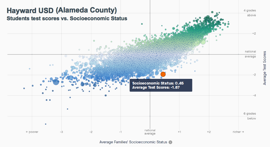
Hayward USD’s students’ scores on CST and CAASPP from 2009-2017 in context of almost all districts in the U.S. (Credit: Stanford Educational Opportunity Project)
But now for the good news. When we look at the learning rate of those students, we see that they’ve learned at a pace about 17 percent faster than students nationally. That is to say, they made about 1.17 grade levels of progress for every year they were in school, compared to the national average. That means that over six years’ time, students in Hayward USD made on average about seven years’ growth. (Take a look at Hayward USD’s report that contains a fuller picture, including gap measures and more.)
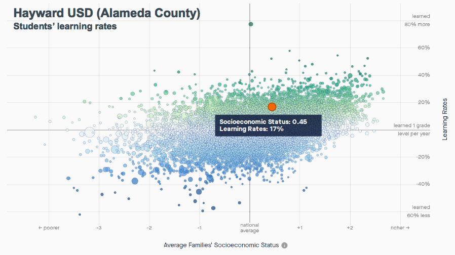
Hayward’s students rate of change on state assessments, from 2009 through 2017. (Credit: Stanford Educational Opportunity Project)
Consider another example of little Holtville, on the Mexican border in Imperial County. Their 1,500 students’ test results over ten years’ time show them to be scoring just about 1.2 grade levels lower than students nationally (1.21 to be exact). And you can see that their socio-economic status puts them well below the national average (-1.03 standard deviations, less well-off than about 84 percent of districts in the U.S.)
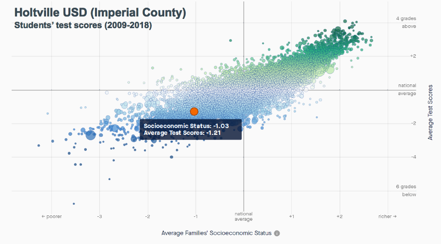
Holtville USD’s students’ scores on the CST and CAASPP, from 2009-2017. (Credit Stanford Educational Opportunity Project)
But come on. You know those test scores reflect what students bring to school, and what they learn outside of school as well as inside. Look instead at the learning rate, which is a far cleaner view of the influence of schools on the rate of kids’ learning over time, we see a different picture. In those years from 2009 to 2018, they learned at a rate 30 percent greater than the rate at which kids learned nationally. Compared to other districts with similar socio-economic attributes (look up and down in a narrow band surrounding their orange dot), they are just about at the very top. If you’re on the LCAP planning team in Holtville, you should not feel like you’re in the dog house because your kids scored low on the CAASPP. Instead, put some pride in your stride, and take a victory lap for enabling kids to learn at a rate 30 percent better than kids in the rest of the U.S. (Take a look at Holtville USD’s report that contains a fuller picture, including gap measures and more.)
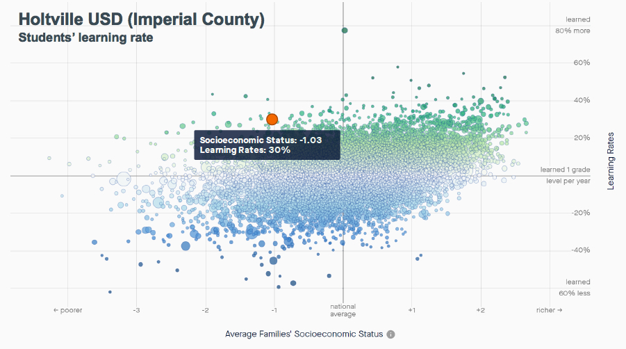
Holtville USD’s students’ learning rates, based on the CST and CAASPP, from 2009-2017. (Credit Stanford Educational Opportunity Project)
The advantage of the long view: maximize true signals, minimize “noise”
You may be wondering why this nine-year look back in time is so valuable. You may have valued the most recent information and consider the most current year to be the most revealing. Well, if you’re reviewing test results with instructional improvement in mind, that would be true. If you’re a principal working with teachers whose students tend to master subject matter more slowly, then you’ll value current results to be sure.
But if you’re planning, what you want to see is evidence of the organization’s effect on many students. That takes lots of test events over a long period of time. In fact, the more years, the better. Patterns of organizational behavior emerge eventually from analysis of lots of events. The more events you can analyze, the more distinct the patterns appear. And equally important, the larger the number of events, students, and test questions you analyze, the greater your ability to reduce the imprecision inherent in all test results. That imprecision is greatest when analyzing small numbers of students, over a shorter number of years, using tests with fewer questions. That introduces what stat-heads call “noise” into the results. The “signal” of authentic measures needs to be distilled from the results, and that requires identifying and canceling out the noise. The long view makes that possible.
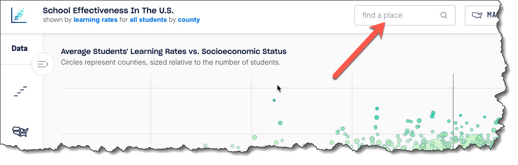
How you can find these reports about your district
Start at this link for the Stanford Education Opportunity Explorer. Then enter the name of your district in this text box.
You’ll see it appear as a numbered dot on the scatterplot and up will pop a descriptive summary on the left side of the screen. If you want to limit the field to displaying only California districts, mouse over the select the data field from the filter on the left side. The text box will prompt you to type the name of our not-so-golden state.
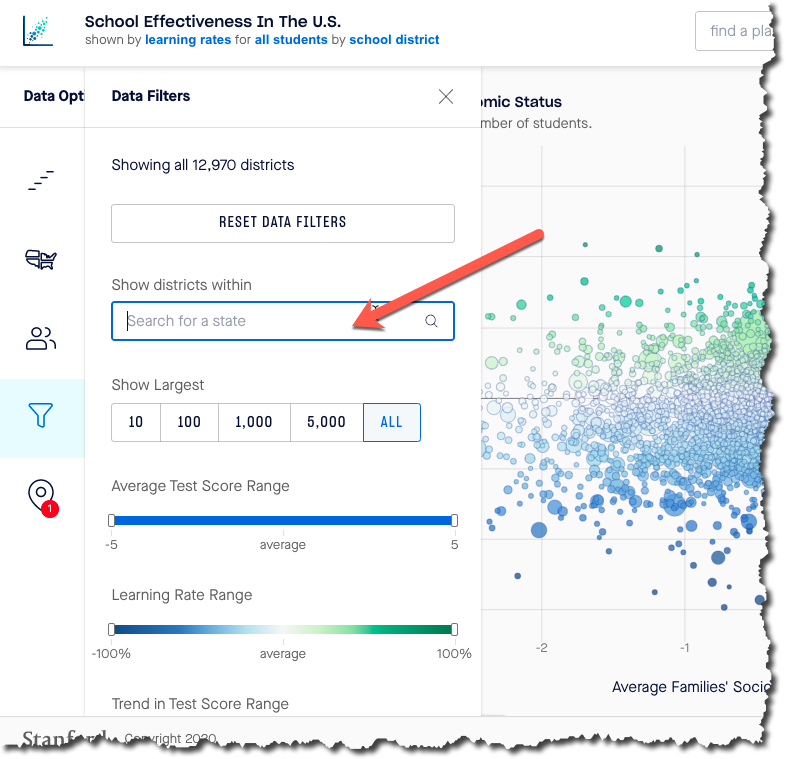 And the result will be that all districts that are California districts will remain colored. Districts outside California will appear grey. This has the added advantage of letting you mouse over the California districts to see their names, without being distracted by districts in other states.
If you want to see schools instead of districts, select the <region> filter and when it appears simply click on “Schools.” Note that the default setting is “Districts.” If you want to select schools by type (magnet, charter, regular), you can do so. If you want to select only schools of a specific grade level (elementary, middle, high), you can also do that. And if you wish to see only schools of a certain type of community (urban, rural, suburban, town), you can also do that.
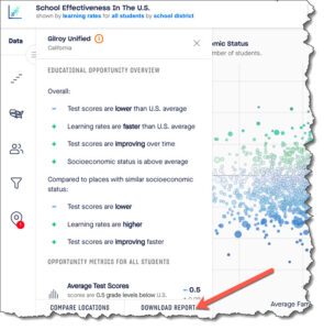 Finally, to obtain a report, click on the “Download report” button in the lower right corner of the data filter control.
Closing thoughts
The ability to see the big picture of learning in your district or school is stunningly powerful. It will spark conversation. It will light a fire under the least data-interested person you know. It is a testimony to the power of the evidence – visual expression of comparative learning. And it is a testimony to the importance of what it shows.
Don’t take the gift from Stanford’s Educational Opportunity Project for granted. Open it up, and take a close look. What you’re seeing is the valuable big picture. I’ll be writing more about why these views of learning are so powerful. So come back soon, and learn more.