The Dashboard has changed a little each year in the way it presents and interprets measures of districts’ and schools’ vital signs. But one thing that has remained unchanged is the Dashboard’s reliance on combining the status of a vital sign with its rate of change.
Has cobbling together two attributes into one color indicator helped or hindered the public’s ability to make sense of the meaning of that indicator? I believe it has put a barrier in the way of understanding both aspects: status and change. In effect, the CDE decision has had the opposite effect than its creators intended. I believe it has diminished public understanding, and done so unnecessarily.
What were the CDE’s motives? Perhaps they were trying to correct the prior accountability era’s reliance on status alone: the Academic Performance Index. Perhaps the Technical Design Group and CDE also believed that joining status and change would simplify the task of understanding how a school or district was doing. If indeed it were simpler, more people could “get it” in theory.
When are we legally drunk? Am I overweight?
In fields where the measurement of phenomena is more advanced than in K12, it’s easy to find cases where two or three attributes are cobbled together to improve the public’s understanding of the compound result. Consider drunk driving, for instance. The Dept. of Motor Vehicles publishes a flyer that you’ve seen when you open your auto registration. It shows a table that tells you when you become legally intoxicated, based on how many drinks you’ve had, your weight and your gender.
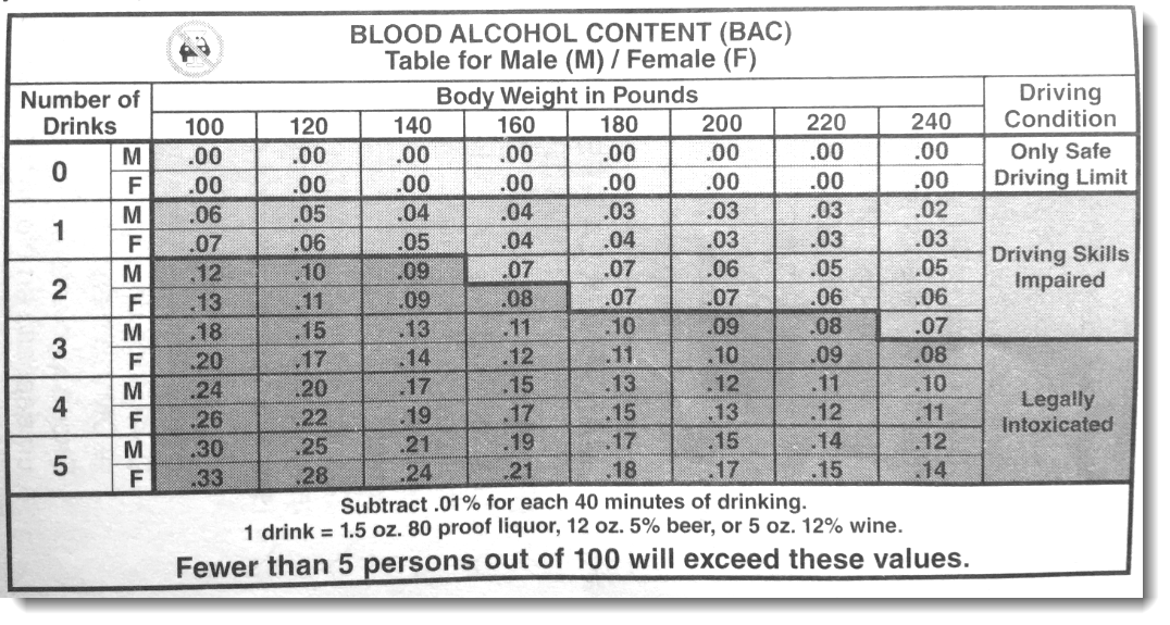 The number of drinks you toss down (and the amount of alcohol in those drinks matters, too, of course) is not sufficient on its own to determine when you’re legally drunk. Your weight and gender matter. If you’re 200 pounds and you’ve had two drinks, your driving skills are impaired. But you’re not yet legally intoxicated. If you weighed 160 pounds, and enjoyed two drinks, if you are a man, you’re not yet legally intoxicated (but darn close). If you’re a woman, however, you would be legally soused (but barely).
The body-mass index chart is another example of the necessary joining together of two factors to answer a simple question: “Am I overweight? You can’t answer this question without referencing at least weight and height. There are also body-mass index charts that account for age and gender.
Financial reporting
But when interpreting status and change, the old world of financial reporting provides plenty of examples. The convention for reporting on stock price movements requires that you report each day or week or month’s trading by showing the highest and lowest prices the stock traded for that day, plus the closing price. Once you chart enough of those over enough days or weeks or months, you have a trend line. The aggregation of “status” events each day (high/low/close) results in a trend line that enables an investor or broker to interpret change.
And change, itself, is complex. Analysts assign three submeasures to change in stock prices: trajectory (which way is it headed), velocity (how fast is it headed there), and volatility (how much up and down movement is there). They don’t stop there. Most stock market charts include a lower deck or tier that represents volume of transactions. The point is that understanding the phenomenon of change requires more information, not less. We’re more likely to make accurate sense of the patterns if we can see its history and its variability.
What can financial reporting teach us about reporting schools’ and districts’ vital signs?
I think the example of charting status and change of stock price movements is a helpful model for making sense of schools’ and districts’ vital signs. Separate reporting of status, with greater regard to its quirks, especially when reporting test results, would help boost understanding greatly. Assessments are imprecise, and the amount of imprecision is known. So is the degree of certainty that the results would recur within the range of imprecision if the same test were taken by the same kids 100 times. This could be represented using stem-and-whisker plots, or error bars and confidence interval bands. Both are conventional.
In addition, separate reporting of change could benefit by revealing the change over as many years as possible. Why restrict the change measure to one year alone? By failing to reveal the full four years of results, the CDE’s Dashboard invests too much meaning in the single year-to-year interval. It is the fuller pattern of change in all prior years that reveals a more robust answer to the question: “How have are our students been doing in math while enrolled here?”
If the CDE wants to improve the understanding of the condition of education in California’s schools and districts, I urge them to stop simplifying these measures. Every effort to simplify results in a loss of information, and at times a violation of the psychometric rules of the game. Rather, trust educators and the public to grasp the real meaning of schools’ and districts’ vital signs by revealing more information, more fully, and visualized more professionally.
To read other blog posts on the errors and illogic of the California Dashboard, click here.