Although the California Dept. of Education’s Dashboard continues to mismeasure gaps, a team of social scientists at Stanford are interpreting gaps wisely. Meet Sean Reardon and his talented colleagues at Stanford’s Center for Education Policy Analysis, the Stanford Education Data Archive, and the Educational Opportunity Project. I’m not simply applauding the quality and quantity of research their team is producing for other scholars. I’m cheering their success in making it understandable to the rest of us, outside of academia.
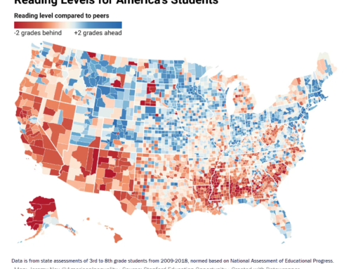
Their investment in explaining how to use what they’ve done is extensive. In addition, journalists at the New York Times have covered many of their findings, sometimes providing interactive data visualizations that enable readers to discover aspects of their own districts’ or schools’ gaps. Thanks to the efforts of the tech team at the NYT, I am able to share with you what Sean Reardon’s team discovered about the variation of testing outcomes, framed in a context that lends meaning to the numbers. That context is the socio-economic status (SES) of the parents: a combination of household income and parents’ level of education. I’ve derived the images below from the interactive story, “Money, Race and Success: How Your District Compares” (4/29/2016)
What you’re about to see are 200 million students’ test results in grades 3 through 8, by district, acquired from all 50 states, from 2009 to 2012. Math and English language arts results are folded together. Forget that the data is behind us. Hold your question about how they normalized state test results across all 50 states. What I’m showing you is a method of making sense of all this.
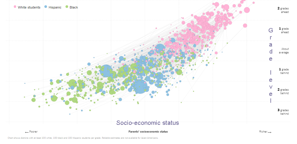
First, note the horizontal scale. Communities serving wealthier districts are to the right. Poorer ones are to the left. They used Census Bureau data about households for this, not subsidized lunch data about students. This enables us to regard SES and ethnicity at the same time, to see one in light of the other. Indeed, we have to see both factors to consider the contribution both make to the gaps that students bring to school.
Second, note the vertical scale. It’s expressed in grade levels, which is a concept that works well if you want to talk about achievement to the public. A clever choice, and also a wise one technically. What Reardon’s team did to determine grade level was to find the average achievement across all districts, and then use the scale scores to estimate where one grade level lower and higher would be placed. Is it hypothetical? Sure. Is it imprecise? Sure. But is it true enough and exact enough for the purpose of comparing achievement? Yes, indeed.
Third, let’s look at the pink, blue and green mass of dots that fill the frame of this data visualization. Pink ones are white students. Blue are Hispanic/Latino students. Green are Black students. The size of the dots corresponds to the number of students depicted.
Okay. You’re now equipped to explore the terrain.
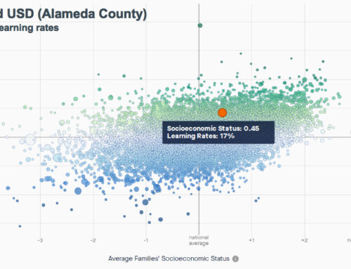
Oceanside USD (San Diego County)
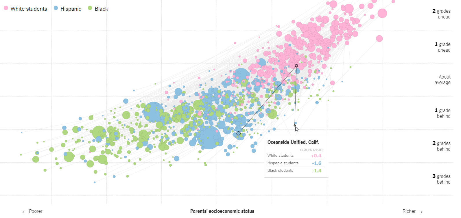 I’ve moused over the dot corresponding to Oceanside USD, one of five districts that serves the massive Marine Corps base, Camp Pendleton. Each district we touch reveals three dots representing students in each of three ethnic groups. The pink ones (white) often appear higher and farther to the right, meaning that white students often score higher, and their parents are often higher on the socio-economic status scale. The length of the lines express how far apart these three ethnic groups of students might be. In Oceanside’s case, the length of those lines is rather short compared to other districts. This means their differences – what we call “gaps” — are smaller. Interestingly, black and white students share an identical SES status. That line straight up and down between them falls to the wealthier side of the midpoint on the Parent SES scale. But their test scores are 1.8 grade levels apart (+0.4 for white students, and -1.4 for black students).
Latino/Hispanic students skew to the left on the SES scale (toward poor). On the test score scale, their results are 2.0 grade levels apart from those of white students (+0.4 for white students, and -1.6 for Latino/Hispanic students).
What can we say about this? Well, we don’t know to what extent these test results reflect what students brought to school, and what school added to what they know. So we can’t be very clear about who or what the gap is describing. We don’t know if these tests are measuring instructional effectiveness. Assessment Jedi master James Popham believes that state assessments do not do that. I find his arguments compelling, and urge you to read what he’s written on this topic yourself. (See chapter 3 of Testing! Testing! What Every Parent Should Know About School Tests, Allyn & Bacon, 2000.)
But it becomes more meaningful when we can compare the geometry of Oceanside’s gap triangle to that of another district, particularly one whose students are quite similar. Because then we can comment on Oceanside’s gap – its size and its SES context – relative to that of another district. (Note that about 60 percent of its students are considered to be “high needs.”)
Colton Joint USD (San Bernardino County)
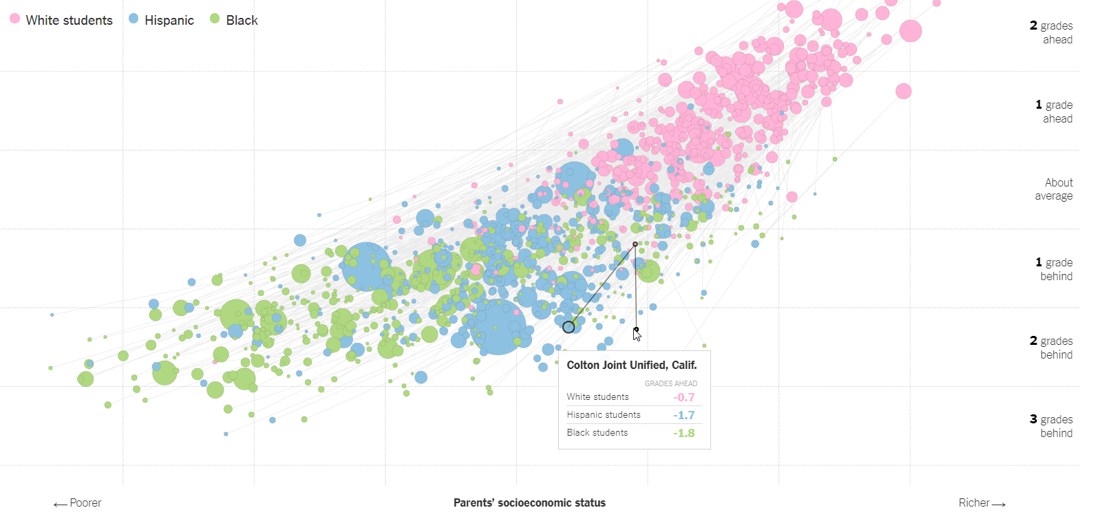 Here we see a similar pattern. The legs of the triangle are somewhat shorter. The distance between each point on the triangle is a bit less than Oceanside’s. And its relative position on the field at large is a little lower and a little to the left — indicating a little lower in grade level, and a little lower SES. The gap separating white and Latino/Hispanic students in Colton is 1.0 grade levels. And the grade level gap separating white and black students is 1.1 grade levels. Colton USD, by the way, has just over 80 percent of its students in the “high needs” category. So we can conclude that Colton’s achievement gap is smaller in size than Oceanside’s, and that the SES differences among the three ethnicities is also somewhat smaller in Colton than in Oceanside.
Berkeley USD (Alameda County)
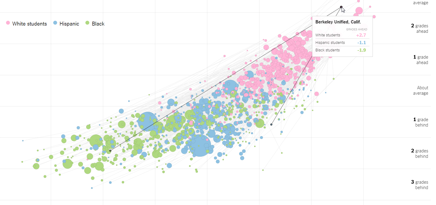
But for contrast, let’s look at a university town, Berkeley, which sits in the prosperity zone of the Bay Area. Like other university towns, its achievement gap is big, and its SES variation is also big. This is expressed in the size of the triangle above, that stretches from the upper right to the lower left of the field. It is home to many prosperous families whose lives are centered on the university. And it is also home to many families on the hard-scrabble side of the fence.
Its white students are high on the achievement scale, +2.7 grade levels above average. Its Latino/Hispanic students are -1.1 grade levels behind average. That’s a gap that is 3.8 grade levels wide. Black students are -1.9 grade levels behind average. That’s a 4.6 grade level wide gap, among the largest of any district in California.
Why are social scientists so far ahead of educators in measuring gaps?
There’s more to be gleaned from these comparative expressions, of course. In a future blog post, I may take you on a deeper dive. But the point I want to make is simpler. If the gap is an expression of educational inequality to some degree, and important to us as an ethical and legal question, why are social scientists able to size that gap and contextualize it so well, while educators are unable to even measure it properly? The gap conversation in education started in my lifetime with the Coleman Report in 1966. In the five decades since then, the discussion, at least in California, has not evolved. It is filled with emotion, but not with reason. The “gap” is just considered to be, in California, a “bad thing,” and present everywhere. This, to me, is a sign of arrested development. When the advances of social science are so near at hand, I can only conclude that education leaders are either unable or unwilling to rely on expertise outside the castle of K-12.